Skip to main content Open Assistant Open Assistant Head to Head Button | Engagement Tools | API Hub
Engagement Tools Widgets, Engagement Tools, BET
Last updated 4 months ago
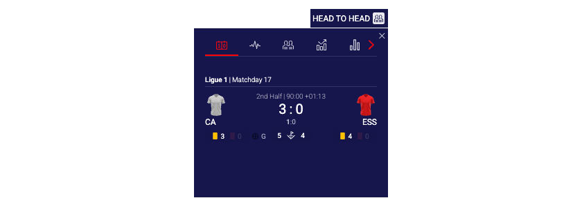
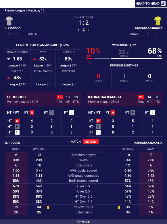
Is this site helpful? Head to Head Button widget displays a compact button that, when clicked, opens a popover containing comprehensive pre-match and live match statistics, head-to-head records, team form, and game momentum data. The widget provides an unobtrusive way to present rich statistical analysis without consuming permanent page space, making it ideal for match pages, live score tickers, or event listings where detailed statistics need to be available on demand. The popover features two distinct layouts: overlay layout where all statistics are displayed in a single- or two-column display (based on available width), and inline layout with fixed popover height and tabbed navigation.
Head To Head Button Default
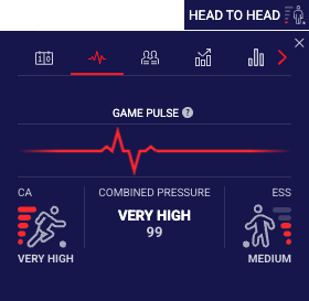
Head To Head Button Game Pulse
Head To Head Button Custom Label and Icon
Previous slide Next slide
See the Head To Head Button widget demo .
# Supported Content and Environment# Required ParametersRequired identifiers:
widget-name : headToHead.buttonmatchId : The Sportradar match identifier. See Getting Identifiers
Environment Requirements
Technical Requirements:
JavaScript enabled
XMLHttpRequest support for data fetching
CSS3 support for styling and animations
Supported Sports
American Football NFL only (including NCAA)
Aussie Rules
Badminton
Baseball & MLB
Basketball & NBA (including NCAA)
Beach soccer
Beach Volleyball
Cricket
Darts
Futsal
Handball
Ice Hockey & NHL
Pesapallo
Rugby (League & Union)
Snooker
Soccer
Squash
Table Tennis
Tennis
Volleyball
Waterpolo
# Main Configurable FeaturesThe widget offers several display modes and content customization options.
Default Button
Game Pulse Button
Custom Button Label and Icon
See the Head To Head Button demo for live examples.
# API Reference# Game Pulse IconsHead to Head is available with three icons sets by default.
Game Pulse Button Version 1 (Default)
Game Pulse Button Version 2
Game Pulse Button Version 3
Custom Game Pulse Icon set
# Components Identifierscomponents property is an object with sport IDs as keys and arrays of strings (tab identifiers) as values.
javascript
{ default : [ "headtohead" , "form" , "teamstats" , "lastmatches" ] , 1 : [ "gamepulse" , "headtohead" , "form" , For every sport you can:
re-order components/tabs by changing order of strings in array,
disable components/tabs by removing specific strings from array
Invalid component IDs are automatically filtered out.
# Examples
Simplified notation
Full object notation
To set same config for all sports, the simplified notation can be used:
See Head to Head Custom Components Order Guide for detailed examples.
# Integration ExamplesProperties do not always transfer from the above table directly into integration code. Properties must be transformed differently for each integration method:
JavaScript/Programmatic Integration
Property names remain unchanged in camelCase
Properties become members of the 4th parameter object in SIR() call
Example: cardVariant: "compact"
In javascript integration, the properties go into an object which is passed as the 4th argument of the call ti SIR() function. Please see Global SIR API
HTML/Declarative Integration
Convert camelCase to lowercase with dashes, e.g. cardVariant becomes card-variant
Add data-sr- prefix
Example: cardVariant → data-sr-card-variant
In all examples replace sportradar in the widgetloader URL path with your clientId.
Example if your clientId is client1:
This URL: https://widgets.sir.sportradar.com/sportradar/widgetloader
becomes: https://widgets.sir.sportradar.com/client1/widgetloader
# JavaScript (Programmatic)Initialize the widget programmatically using the JavaScript API. The widget renders in the specified container element.
Overlay Layout
Inline Layout
Custom Components Order
Custom Button Label and Icon
# HTML (Declarative)Insert the following HTML code at the target widget location.
Important: Callback functions (customOnClick) cannot be set via HTML attributes. Use JavaScript/Programmatic integration for these features.
Overlay Layout
Inline Layout
Custom Components Order
Custom Button Label and Icon
javascript
{ layout : "overlay" // Default } Button opens a floating popover overlay. Ideal for compact spaces where statistics should appear on-demand.
Property Type Required Default Description matchIdnumberYes - Sportradar match identifier. See Getting Identifiers positionstringNo "right"Popover position relative to button. "left": Popover opens to the left of button"right": Popover opens to the right of button"bottom": Popover opens below button widthnumberNo 320Width of popover in pixels. Recommended range: 280-600. Popover has max-width of 90% viewport width layoutstringNo "overlay"Display mode for statistics content within the popover. "overlay": Responsive layout, two columns when width exceeds 580px, single column below"inline": Layout with fixed height and with tabbed navigation. labelstringNo "Head to Head"Text display next to the button. Also acts as a click trigger. iconstringNo Default icon URL of custom icon image to display on button. Ignored when gamePulseBtnEnable is true and match is live gamePulseBtnEnablebooleanNo falseReplace button icon with Game Pulse indicator during live matches. Shows match intensity visually on button gamePulseBtnVersionnumberNo 1Version of Game Pulse button indicator design.1, 2, 3.Game Pulse Icons for more information. gamePulseBtnTooltipbooleanNo falseWhen true, hover over button icon will display tooltip with Game Pulse content. btnBaseClassstringNo - CSS class for button styling. Controls button background and text colors themingClsNamestringNo - Additional CSS class applied to popover container for custom theming disableScoreboardbooleanNo falseWhen true, hides the scoreboard tab. Useful when match score is displayed separately on the page showLastMeetingsbooleanNo falseDisplay last meetings section in head-to-head tab with detailed match history showSimpleFormbooleanNo falseUse simplified team form display instead of detailed match-by-match results. Shows win/draw/loss indicators only showGamePulsebooleanNo trueInclude Game Pulse momentum tab in statistics. When false, Game Pulse tab is hidden gamePulseIconSetobjectNo See Game Pulse Icos Used to set custom match pulse icons. Value for each icon should contain URL pointing to the desired icon. statisticsEnableMatchStatsbooleanNo trueEnable match-specific statistics tabs. When false, hides match-level statistical comparisons statisticsEnableSeasonStatsbooleanNo trueEnable season statistics tabs. When false, hides season-level team statistics componentsobject | arrayNo See Components identifiers Configuration object defining which components to display and their order. customOnClickfunctionNo - Custom click handler function. When provided, overrides default popover open/close behavior. Receives click event as parameter s5ClientAliasstringNo - S5 client alias to be used for direct link to additional statistics (on S5 solution). Required for "More Stats" button to function. enableShowMorebooleanNo falseWhen true, displays the "More Stats" button that links to detailed statistics on the S5 Statistics Centre.
javascript
{ gamePulseBtnVersion : 1 } "teamstats"
,
"teamstatsmatch"
,
"lastmatches"
]
,
// soccer
2 : [ "headtohead" , "form" , "teamstats" , "lastmatches" ] , // basket
3 : [ "headtohead" , "form" , "teamstats" , "lastmatches" ] , // baseball
4 : [ "headtohead" , "form" , "teamstats" , "lastmatches" ] , // ice hockey
5 : [ "headtohead" , "form" , "teamstats" , "lastmatches" ] , // tennis
6 : [ "headtohead" , "form" , "teamstats" , "lastmatches" ] , // handball
12 : [ "headtohead" , "form" , "lastmatches" ] , // rugby
13 : [ "headtohead" , "form" , "teamstats" , "lastmatches" ] , // aussie rules
16 : [ "headtohead" , "form" , "lastmatches" ] , // american football
19 : [ "headtohead" , "teamstats" , "lastmatches" ] , // snooker
20 : [ "headtohead" , "lastmatches" ] , // table tennis
21 : [ "headtohead" , "form" , "teamstats" , "lastmatches" ] , // cricket
22 : [ "headtohead" , "form" , "teamstats" , "lastmatches" ] , // darts
23 : [ "headtohead" , "form" , "lastmatches" ] , // volleyball
26 : [ "headtohead" , "form" , "teamstats" , "lastmatches" ] , // waterpolo
29 : [ "headtohead" , "form" , "teamstats" , "lastmatches" ] , // futsal
31 : [ "headtohead" , "lastmatches" ] , // badminton
34 : [ "headtohead" , "form" , "lastmatches" ] , // beach volleyball
37 : [ "headtohead" , "lastmatches" ] , // squash
60 : [ "headtohead" , "form" , "lastmatches" ] , // beach soccer
61 : [ "headtohead" , "form" , "teamstats" , "lastmatches" ] , // pesapallo
137 : [ "headtohead" , "form" , "teamstats" , "lastmatches" ] , // esport: E-soccer
153 : [ "headtohead" , "lastmatches" ] , // esport: E-basketball
195 : [ "headtohead" , "lastmatches" ] , // esport: E-ice hockey
}
Scoreboard component/tab is always positioned first and can not be re-ordered. Additionally, scoreboard component/tab can not be removed using components property. Use disableScoreboard property instead to remove scoreboard.
components : [ 'headtohead' , 'form' , 'teamstats' , 'lastmatches' ]
Example: filters.sport.hidden → Complex objects must be passed as JSON strings
In HTML integration, the properties go into the parent HTML object as object properties, prefixed with data-sr- as explained above.
Only base property support
This method supports only simple (base) properties and does not support properties that require functions.
In all examples replace sportradar in the widgetloader URL path with your clientId.
Example if your clientId is client1:
This URL: https://widgets.sir.sportradar.com/sportradar/widgetloader
becomes: https://widgets.sir.sportradar.com/client1/widgetloader
javascript
( function ( a , b , c , d , e , f , g , h , i ){ a[e] || (i = a[e] = function (){ (a[e] . q = a[e] . q || []) . push (arguments) }, i . l = 1 * new Date , i . o = f , g = b . createElement (c) , h = b . getElementsByTagName (c)[ 0 ] , g . async = 1 , g . src = d , g . setAttribute ( "n" , e) , h . parentNode . insertBefore (g , h) ) } )(window , document , "script" , "https://widgets.sir.sportradar.com/sportradar/widgetloader" , "SIR" , { language : 'en' } ) ; // Use PREMATCH match ID SIR ( 'addWidget' , '#sr-widget' , 'headToHead.button' , { matchId : 61591316 , layout : 'overlay' } ) ; html
< div id = "sr-widget" ></ div > html
< div id = "sr-widget" data-sr-widget = "headToHead.button" data-sr-match-id = "123" data-sr-layout = "overlay" > </ div > < script type = "application/javascript" src = "https://widgets.sir.sportradar.com/sportradar/widgetloader" async > < / script > 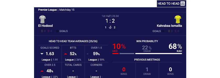
