#What Is Widget Theming?
Widget theming allows you to customize the visual appearance of Sportradar widgets to match your website's design and branding. With theming, you can:
- Match your brand colors - Apply your primary, background, and text colors
- Adapt to different designs - Use light or dark themes that fit your site's style
- Maintain consistency - Ensure widgets look cohesive with your existing interface
- Support team colors - Automatically adapt widget colors based on competing teams
#Steps
#Find Your Widget Demo
-
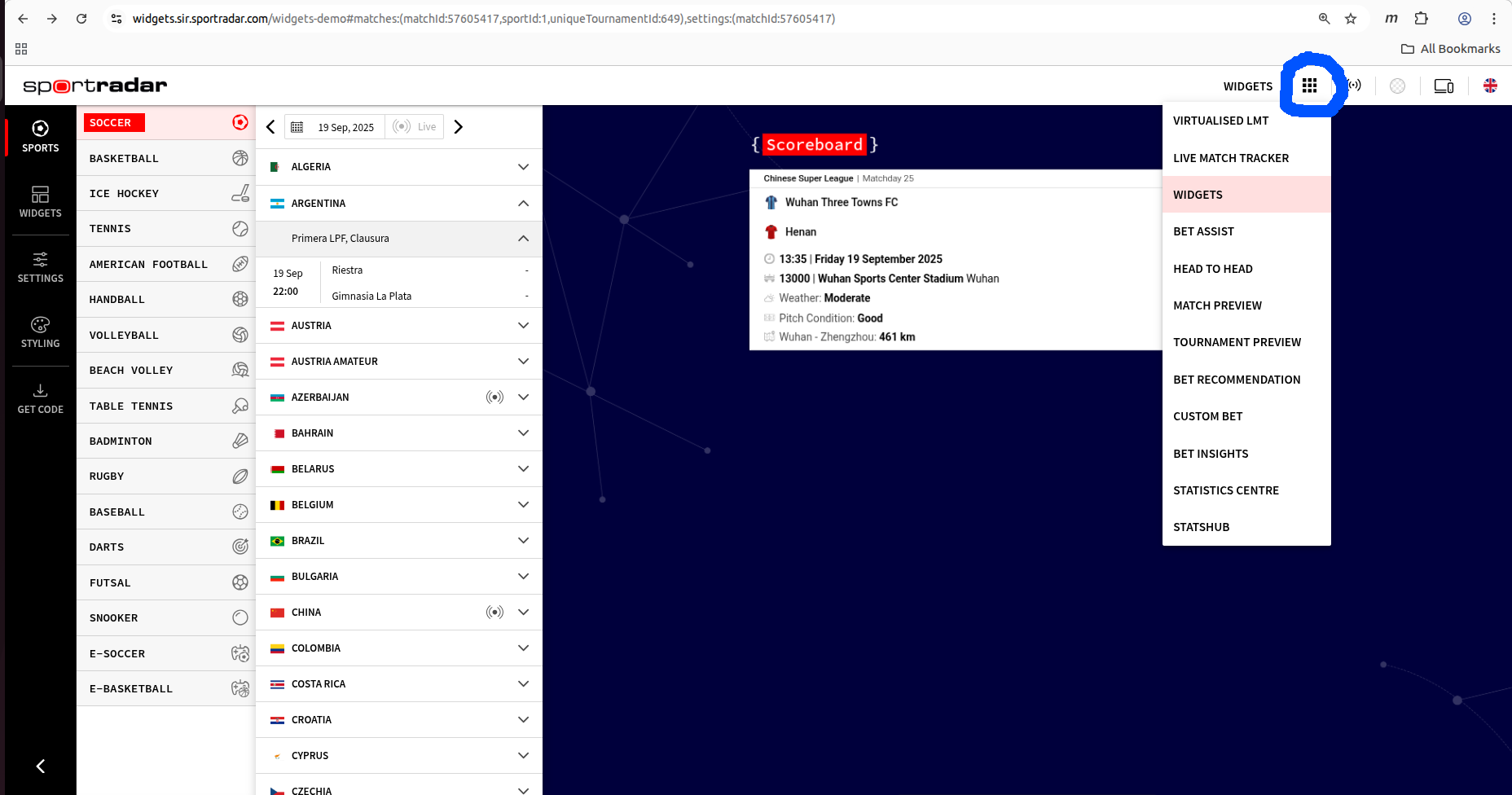
Go to widgets demo page
-
Find your widget in the grid menu on top
View screenshot
-
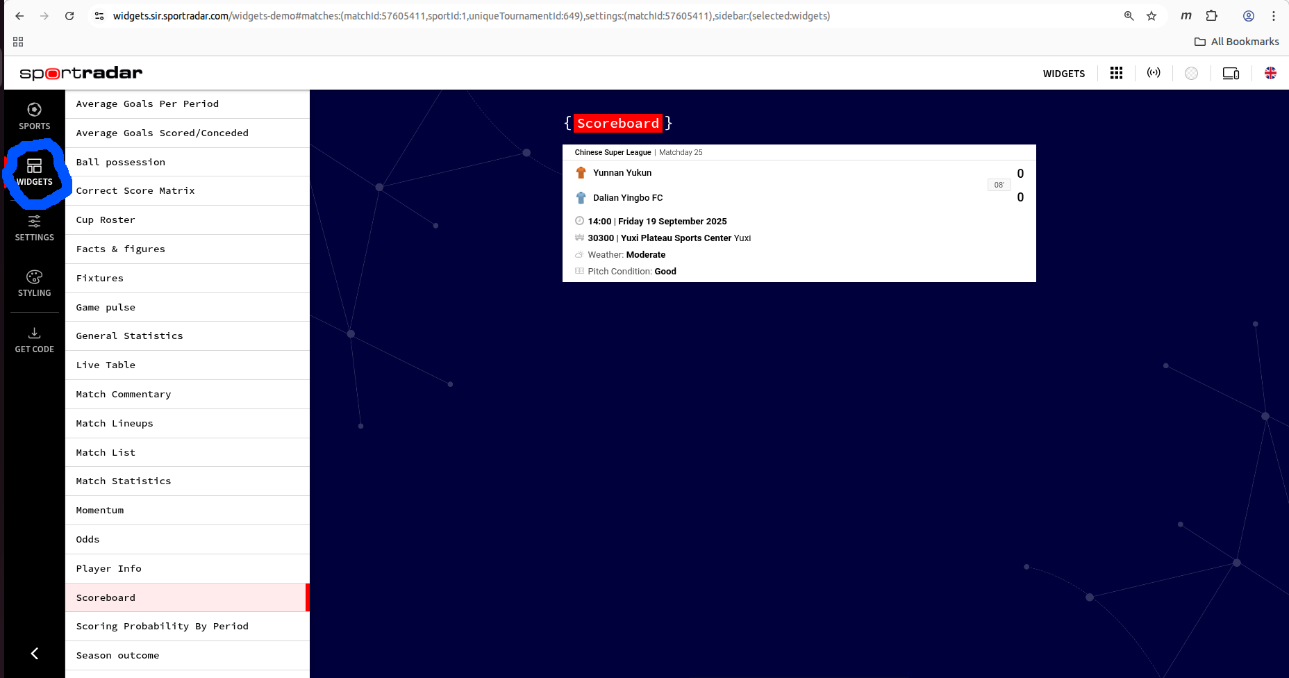
If unable to find your widget in the grid menu, select widgets and click the WIDGETS option on the left side menu
View screenshot
-
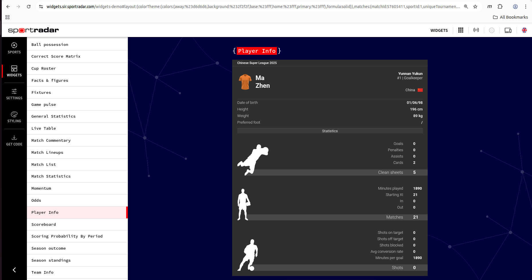
Select your widget, make sure you see your widget loaded in the main viewing panel
View screenshot
#Use the Styling Menu
-
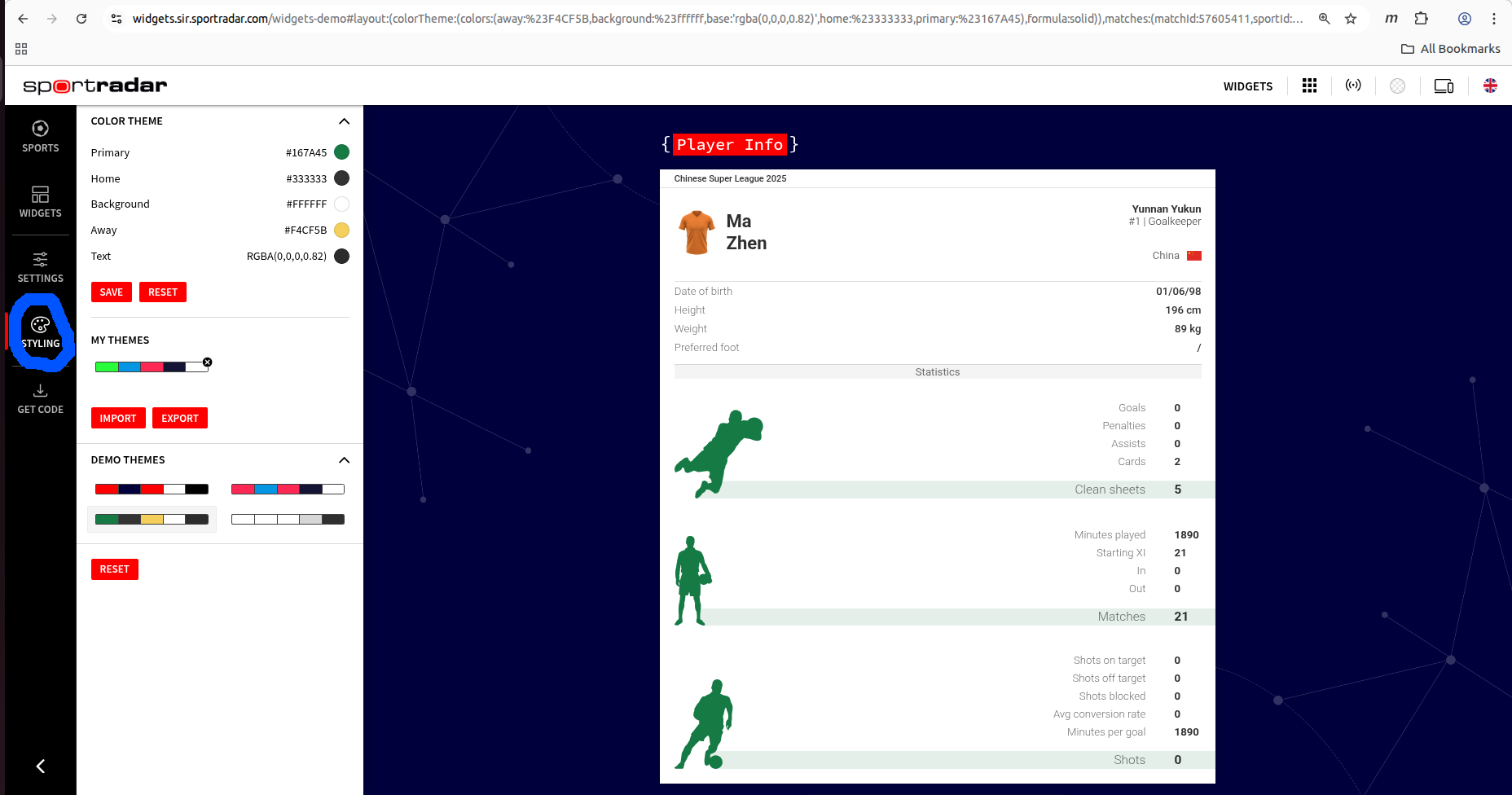
Click the styling menu on the left
View screenshot
-
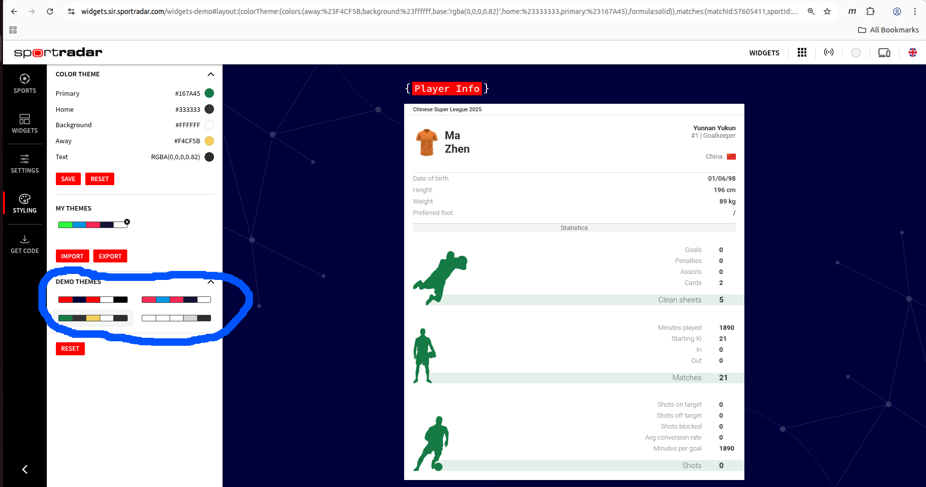
In the styling menu you can select from a number of prepared themes
View screenshot
-
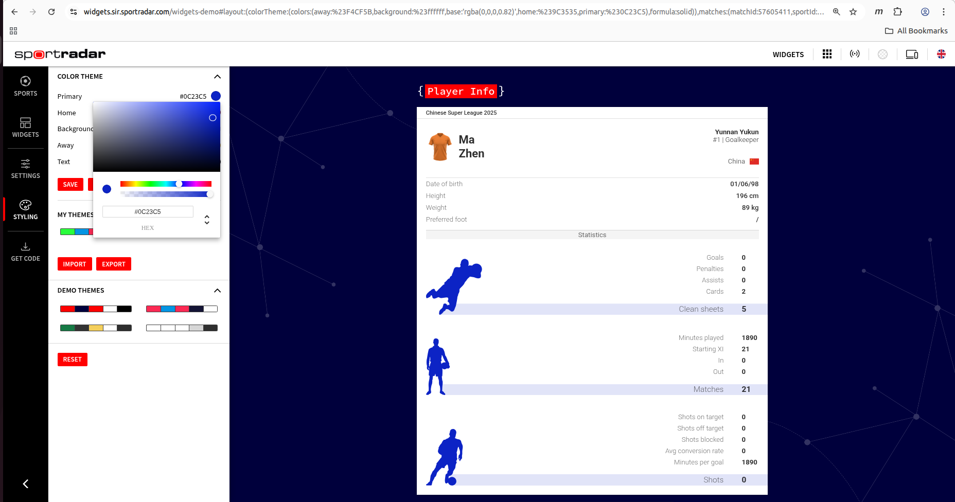
You can also hand-pick the five most important colors
View screenshot
#Understanding the Five Core Colors
Each widget theme is built around five essential colors that control different aspects of the appearance:
Primary Color
Purpose: Main action elements, highlights, and branding accents
Used for: Buttons, active states, important highlights, selection indicators
Example: #FF0000 (red) for call-to-action elements
Home Color
Purpose: Home team representation in sports widgets
Used for: Home team scores, names, and related elements
Example: #00003c (dark blue) for home team styling
Away Color
Purpose: Away/visiting team representation in sports widgets
Used for: Away team scores, names, and related elements
Example: #ff0000 (red) for away team styling
Background Color
Purpose: Main widget background and container areas
Used for: Widget backgrounds, card backgrounds, modal overlays
Example: #FFFFFF (white) for light themes, #141435 (dark) for dark themes
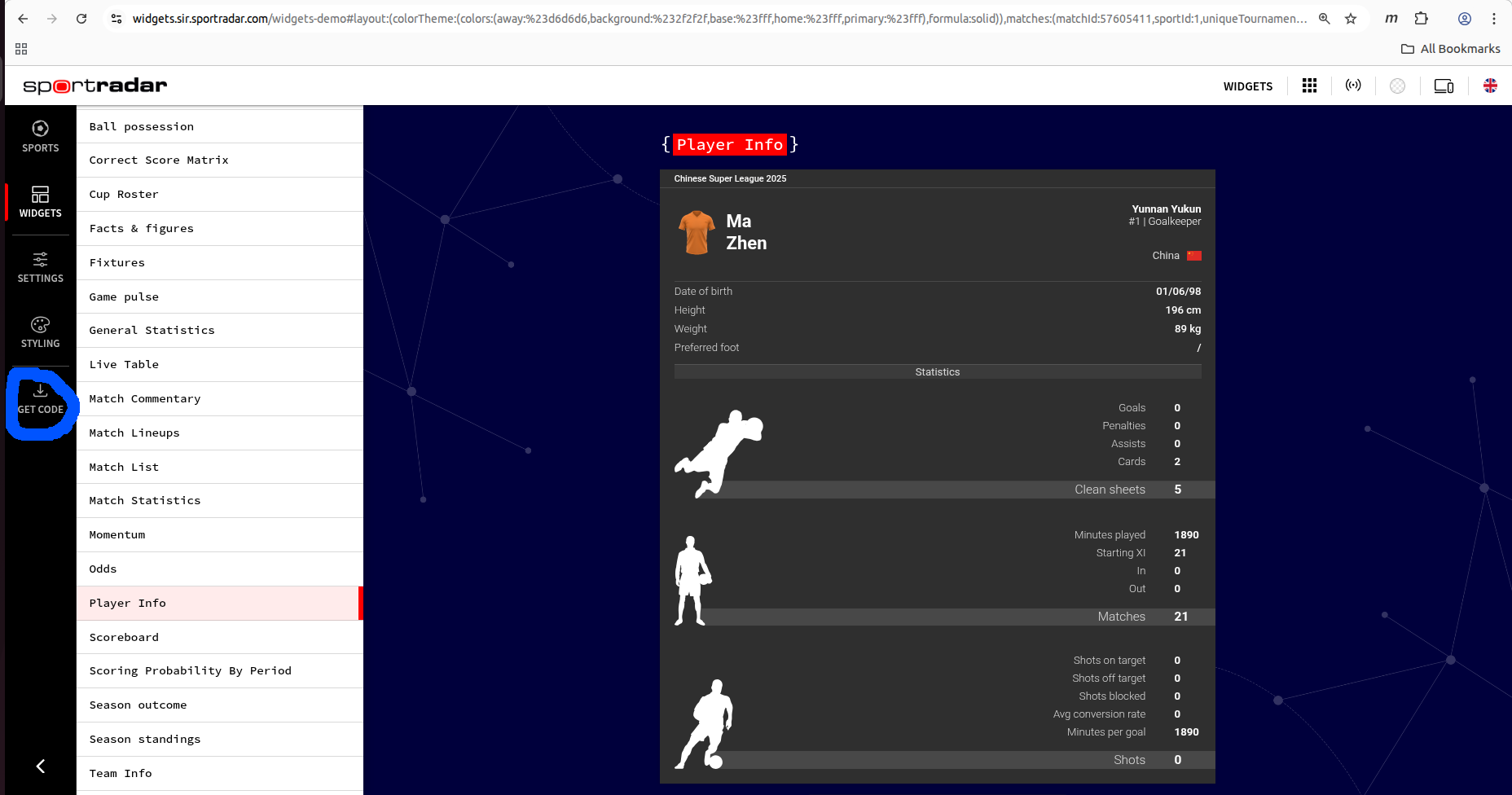
#Download Widget Code
-
Click the get code option on the left side menu
View screenshot
-
Download the code, save it
The downloaded package includes three files:
- preview.html with your widget included
- script.js containing code to include your widget
- theme.css containing styling of your widget
Example theme file include:
<link rel="stylesheet" type="text/css" href="theme.css" />#Advanced Customization
#Fine Tuning Your Theme
After downloading your theme, you can make detailed adjustments by editing the theme.css file. The theming system uses a specific CSS class naming convention to avoid conflicts with your website styles.
#CSS Class Naming Convention
Recommended: Use .srt- prefixed classes
These classes are designed for customization and are safe to modify:
/* Background colors */
.sr-bb .srt-base-1 {
  background-color: #f5f5f5;
}

/* Text colors */
.sr-bb .srt-text-primary {
  color: #333333;
}

/* Border styles */
.sr-bb .srt-border-1 {
  border-color: #e0e0e0;
}If you need more fine grained control over styling, you can write your own styles, but we encourage you to only style classes with prefix, which are meant for branding. We offer no guarantee that any other classes or internal widget structure won't change in the future. You also need to use at least 2 class selectors for every rule (.sr-bb is always available on every widget), so they are not overridden with our css normalization rules.
#CSS Isolation Rules
Important for CSS Isolation
All widget styles are scoped within .sr-bb containers. For proper isolation:
- Don't use
sr-orsrt-prefixes in your site's CSS - Avoid bare element selectors like
div,span,pin global styles and using spacing properties likeradius|top|padding|marginmight cause issues with future updates to your setup. - Test thoroughly after theme changes to ensure no style conflicts
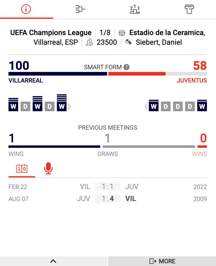
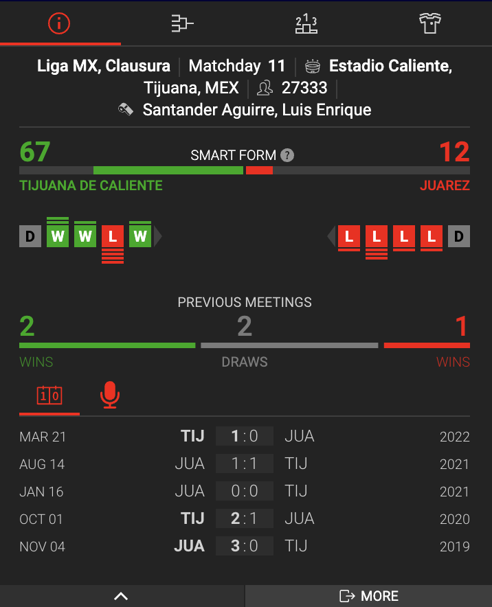
#Showcase
As mentioned earlier, we have predefined themes on our demo page. Here are two showcases, light and dark theme, for our Match preview widget.